LESSŌ SIMULATION
Any box.
One procedure.
Lessō does not care about the category. Electronics, food, cosmetics, anything. Whatever the design, Lessō runs the same logic: photographs become line drawings, and the space that frees up is taken over by the logo. The logo keeps its form, its typeface and its proportions. The brand’s DNA does not move.
This is a simulation based on a fictional product.
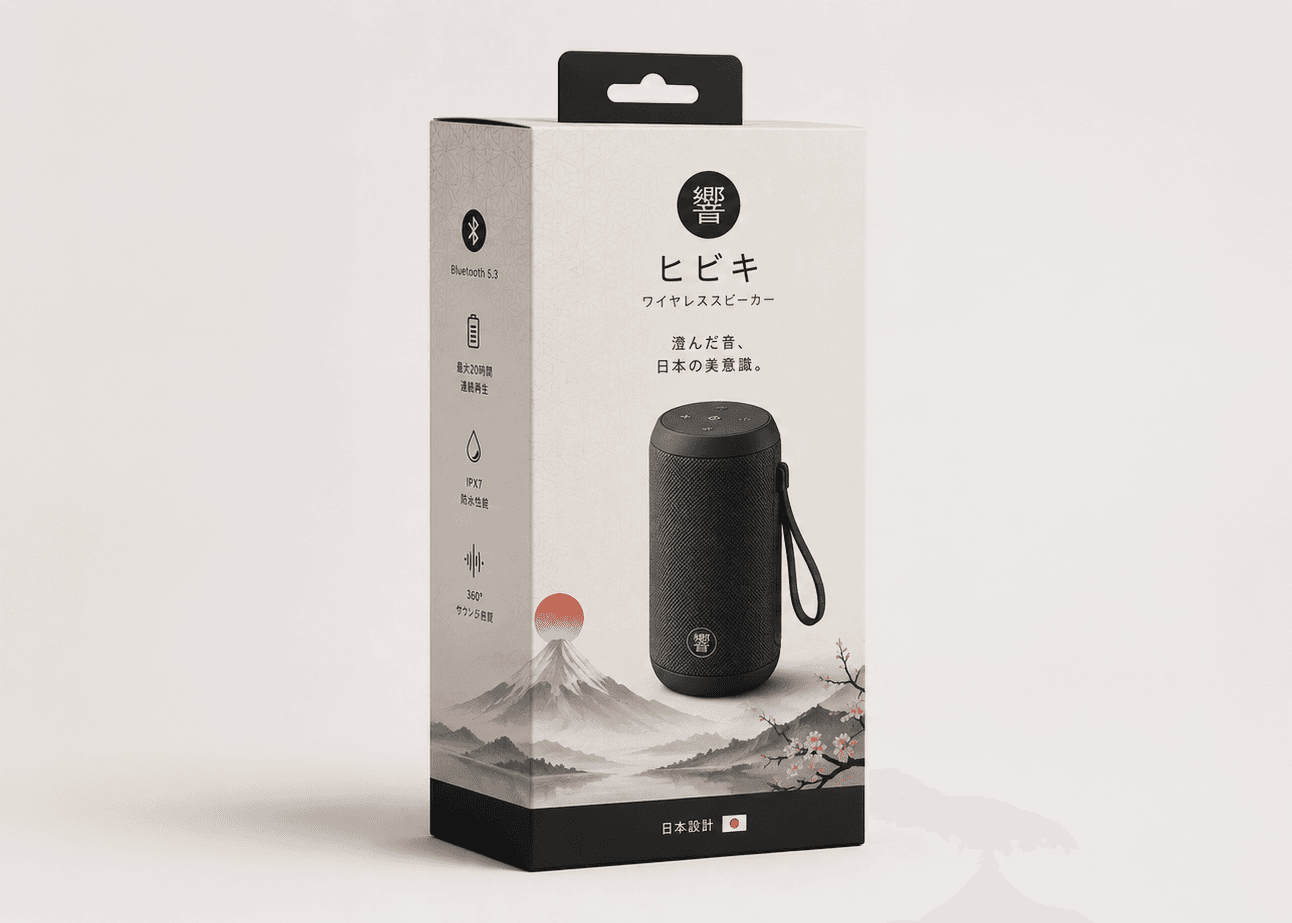
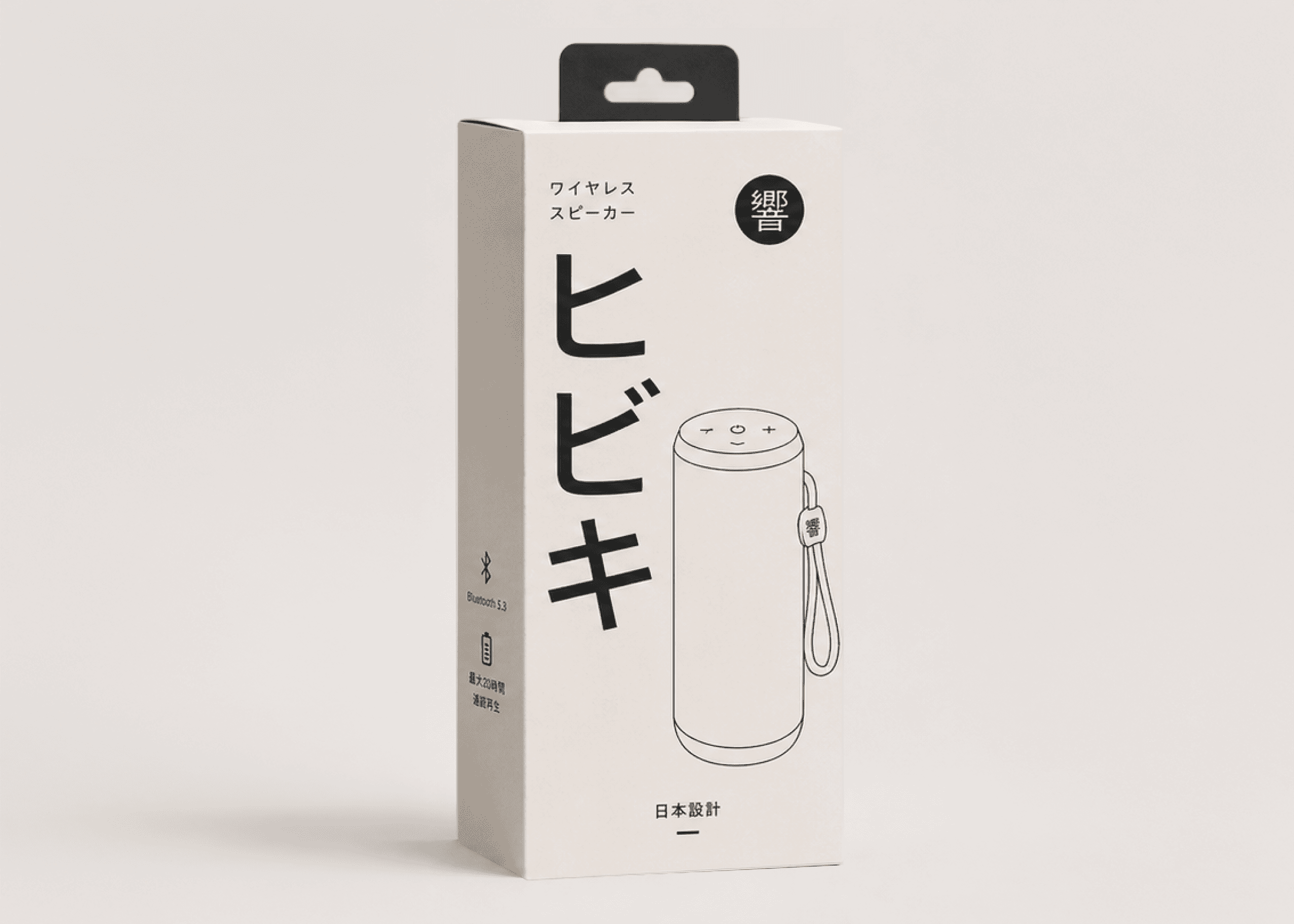
Give the cost back. Keep the brand.
Pressure comes from outside. An ink goes scarce. A cost jumps. A sustainability target lands on someone’s desk. The goal never changes: it still has to be desirable.
Fewer plates, same shelf.
Whatever the category, the pack has to read at one meter, on as few printing plates as possible. The wordmark stays. The silhouette stays. Everything else is open.
At least 65% less ink at level 3 (worked estimate).
Dropping colours is not what saves ink. Taking the ground off the board is. That single move, together with line art in place of photography, carries most of the saving.
Estimated ink usage. The reduction in print cost is a separate figure; confirm it with your printer’s quote.
You did not give up colour.
What you gained is a sharper brand.
BEFORE / AFTER · ESTIMATED RANGES
One design.
Three levels of subtraction.
ink used
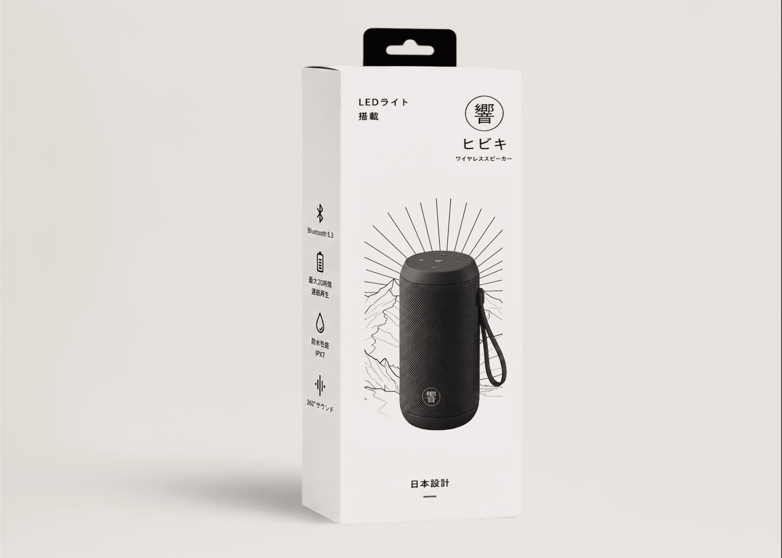
ink used
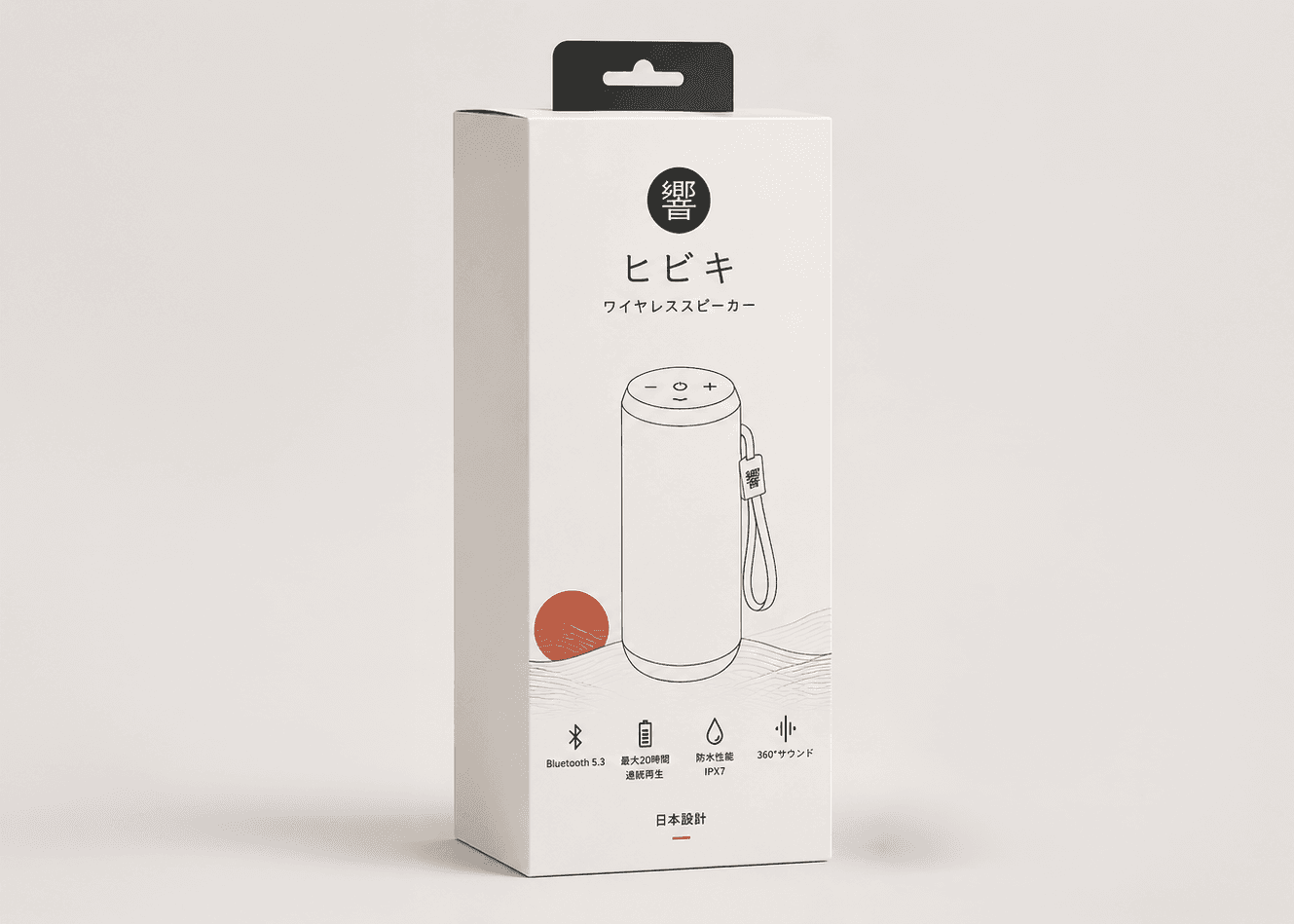
ink used
ink used
Indicative ink usage. Actual figures vary with the product and the printing conditions.
NEXT MOVE
Your product, too.
Let’s subtract.
Upload a photo and ask Lessō for a design. You will have a new one in moments.